ArtStudio88 ~ Original Design, Artwork & Calligraphy
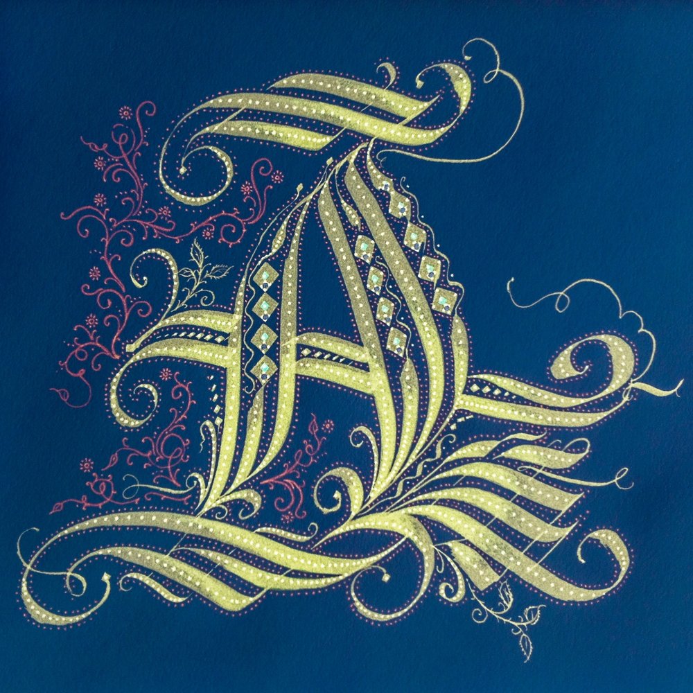
The Cadel differs from other capitals used as Versals in that it is composed of interlacing strokes rather than built-up strokes. It is drawn with a constant pen angle - this produces thick and thin strokes that create a pattern with continuously changing direction of line. In this way, substance is added to an otherwise skeletal letter.
Interlaced strokes can also be used to embellish the ascenders on the top line of a page of text or the descenders on the bottom line.
All rights reserved, U.S.Copyright 2015.
Watercolor inks on Arches paper, 2015.
USPS envelope for postal mailing, watercolor in grey and metallic silver, original inking, 2021.
A close-up look at some of these can help the viewer appreciate the intricate work that makes up the composition of each piece. The organic imagery of the washes that hold each piece's background are in sharp contrast to the calligraphic strokes that make up the lettering composition as well as the detailed pinpoint colorations. These detailed enlargements represent less than a 4 square inch area.
Every art piece is done in colorfast watercolor dyes on Arches Archival Papier handmade in France.
All rights reserved, U.S.Copyright 2015.
The great variety of existing Cadel models makes it difficult to assemble a complete alphabet. Cadels can look very daunting to accomplish, but the basic principle is to start with a basic structure and build around it. The golden rule is as with any skill, practice, practice, practice.
Initial sketches shown here are early attempts to clarify a new approach to designing an easily recognizable capital letter. The originals were typically in black ink only.
All rights reserved, U.S. Copyright 2015.
The intricate interlacing of strokes that makes up the composition, or weaving, is the hallmark of Cadel Calligraphy design. The initial sketch is a sort of pattern to follow and then the artist can layout the initial strokes and follow up with the deeper tones and embellishments.
All rights reserved, U.S. Copyright 2015.
Watercolor, pen and ink are subtly combined to create several images for the “TWELVE” Asian Zodiac Animal Symbols. Watercolor pigments are applied on heavy Archival grade paper with Himalayan salts and then drawn over with pointillism precision to create the details seen here. Each illustration has thousands of dots.
Added for October, 2015 is the Deep Sea Collection pieces. These include the interpretational series of 'Sea Grass", "Octopus", and "The Giant Pacific Red Octopus".
All rights reserved, U.S. Copyright 2018.
This artwork is based upon the mythological beasts that partner with the Water Dragon of 15th century Ming dynasty. This dynamic composition features the jumping carp as it leaves and returns to the sea in royal blue and gold.
An established Automotive Repair Shop of over 40 years needed an updated Logo. The shop services classic Porsche, Volkswagen and Audi vehicles. Since the owner wanted to update the shop’s image, it also wanted to appear ‘classic’ and performance oriented. The images here represent a series of color ideations for the first set of logo design ideas.
The Final Logo design for signage and labeling includes the website address and the ‘performance’ black& white flag oval graphics. The business card is a bit simpler that includes the text seen here.
HG Helen Glover Fine Artist Logo design is a clean ligature of the HG and drop-shadow to lift it off the surface visually. The highly detailed pencil illustration of the dog (Pug) is included as an example with the pencil rendering in Illustrator.
Mailable Artwork - Custom Envelopes with coordinating Stamps.Click on the Artwork to review each section.


